Transit Alliance and Jarrett Walker Associates developed the “Choices Report,” a preliminary tool to discuss a proposed Bus System Redesign. Here are some of the maps and demographics from that report.
More info: http://www.betterbus.miami
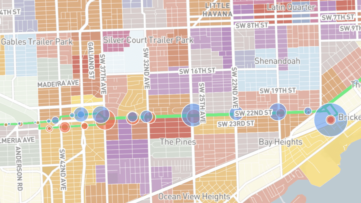
Transit Alliance has begun to conduct research on the Better Bus Project. The project is a comprehensive redesign of the county bus system. Through this research with Jarrett Walker Associates, county maps were created to get a sense of the micro-populations in Miami, and where transit demand or potential demand would be the highest/lowest. These maps help give us a sense of where Miami is now, in terms of transportation, density, land use, and where it could be headed.


The maps above represent 2 different kinds of density: residential and office. They tell 2 different stories of where Miamians spend their time. While areas like Little Havana, Hialeah, and North Miami Beach have dense residential development, Doral, US1 south, and Miami Beach have some of the most jobs. The importance of connecting residential to urban centers is evident. At a time where multi-use areas are rising, it is important to note that industrial districts cannot be multi-use and will continue to drive employment-related traffic patterns.


These maps both relate to walkability and the importance of connectivity. Connectivity is measured by how far in every direction a walker can travel with the street design in the neighborhood. Dead ends, limited crosswalks, urban infrastructure, etc. lower walkability. The map on the right acknowledges some of the nodes that people live/work/walk in around the county. The map on the left shows overall connectivity. This connectivity map is not equal to walkability, but potential walkability. In order to equate it with walkability, factors such as shade, sidewalk width, etc. would need to be included.


To get a better sense of inequity, these maps were drawn to map zero vehicle households, senior households, and households below the poverty line. Using these, areas that have more need can be taken into account, ensuring that they do not fall through the cracks. These maps show us a few pocket areas of importance to transit. South Dade showing dense underserved populations around US1, with low senior populations indicated new immigrants and young families. Hialeah having a high percentage of seniors and few cars along Okeechobee road indicated a dense older neighborhood. And South Beach showing a high population of zero car households with few seniors and a low poverty rate showing a pedestrian neighborhood that is not underserved.

There are many takeaways from these reports beyond transit, but the purpose of it was to make an informed decision on what direction the bus network should move in. The report offers 2 extremes, a system that focuses on coverage (getting to every person everywhere with less frequency) or a system that focuses on ridership (focusing buses on high transit and dense populations with high frequency). There are areas where each is a viable choice, and I imagine a hybrid will develop in the coming months. However, these maps give us a launchpad to discuss a turning point in a county that has gone through a lot of demographic change in a short period of time.
See the full report here.
Be sure to follow us on Facebook, Instagram, & Twitter.
—
Sources:
https://www.wlrn.org/post/transit-alliance-director-miami-can-be-city-has-excellent-public-transit
Transit Alliance reporting to the Miami-Dade Commission:

Very correct research. But I am almost one hundred percent sure that a system focused on ridership (focusing buses on high transit and dense populations with high frequency) will be much more expedient for these purposes.
LikeLike
[…] Before drawing the concept maps, residential densities, jobs, and underserved populations were mapped and discussed in workshops across the county. Recent areas of high population growth are shown to […]
LikeLike